Friday, January 28, 2011

Preston Tyson's Artist statement


            Hello I’m Preston Tyson, I am writing an artist statement about my work in photography class. My work is more of a simple yet effective approach rather than complex, I don’t really like complex photos it makes it seem hard to comprehend. Media arts helped me how to take picture correctly and I liked it. Now that I’m done with the beginning media arts I feel like I can call myself a photographer because of taking this class. I can connect to other artists now that I have the knowledge of a photographer.
           
I had paid homage to the photographer named Minor white, who took pictures of landscapes and some of people. I chose him because I felt like my photography could be close to his in a way that is simple yet effective. The type of photos he took seem to enlighten me having to spark something within me that when I take photos I should think like my photographer I chose, as like he was tutor to me. Along with paying homage to a photographer we also had to mix our photos with the pictures of the photographer we chosen, it was basically copy and paste then blend the photo to the other photo.  

Typography as next as a new project of creating photos with words in them as like an advertisement. I think typography was kind of easy for the fact that it was blending words with photos in a unique way making a whole new picture. My approach to typography was kind of weak only because I didn’t have enough pictures to make a different typographic picture. However I did enjoy it because I wanted to make something unique out of the pictures I had.

I think my work in this photography class has a somewhat amateur approach but I’m still working on that, it needs a more complexity to my photos to make them seem more interesting. Working with Photoshop helped my photos have an interesting look in them. I do hope I people appreciate my photos I’ve taken.
Wednesday, January 5, 2011

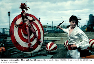
Annie Leibovitz

            Annie Leibovitz started having a interest in photography but it was when she went to japan in her sophomore year of college. Originally she was interested in painting but took a photography class and became interested. After college she became a photographer as a career, and came into the rolling stone magazine becoming the main photographer of the rolling stone magazine. Later on she had projects in photographing celebrities on vanity fair and vague.

        In her work she had somewhat a simple but effective photographs that made it look like it wasn't simple. With other work like photographing celebrities she used good lighting with bold colors and poses for the celebrities. Although in the beginning she had her photos in black and white not using lighting upon her photos.


Thursday, December 16, 2010


This is my Typography pictures i have made. All of them are entirely my ideas and photographs.

Friday, December 3, 2010

Nothing by Connie Wanek Designed by Preston Tyson


              This is my design i made by having one side that is black that represents a light dying and the other side having a light that lit up. It differs between a dying light and a light that starts to lit up.

Thursday, November 4, 2010

Helvetica


        Helvetica is commonly used font in U.S and other parts of the world. This famous font is used by alot of businesses and is more approved than other font type. Its mostly used as typography by typography designers in businesses. I think this type of font is a little too common because its shown everywhere in businesses and governmental proposes.


       Helvetica was created in 1957 by a guy named max miedinger, a font designer that had help from another person named Eduard Hoffmann. The font its self is a typeface that is neutral in almost any type of signage. When it was being developed helvetica was being used on steel in order to use it on different signage. 

Wednesday, October 27, 2010

Minor White: Vintage world


My work is doing retro photos of the past and putting them with new photos of the present, they are called vintages. These vintages are of mainly the photos that i took and photos of my photographer that I'm paying homage to. All of the vintage photos that were made is completely made by me with the help of the photographer Minor white.

Thursday, September 30, 2010

Minor White:Paying homage


         I'm paying homage to Minor White because of his photos having a textual feeling to making them  you know how they feel. His photos shows spiritual side of the natural world,but also his photos have symbols of emotions in the photos. The photos has a recognition to them showing emotional factors that make the viewer seem they have a direct feeling towards it. I think his photos is what pulled me in to paying homage to him.